
 Today for your viewing pleasure I have a couple of style guide pages.
First up since Spider-man seems to be on everyones minds these days I have a page from the Spider-man Animated Series Style Guide. Spider-man's Animated series came along around the mid nineties on the heals of another great superhero animated series. I'll admit I was a fan of both, and the Spider-man series did seem rather well done for younger market. Characters where bright and colorful, even the villains, and the toys that were spawned for this cartoon matched the animated versions quit well. even today these are some of my favorite toys from any Spider-man show or movie.
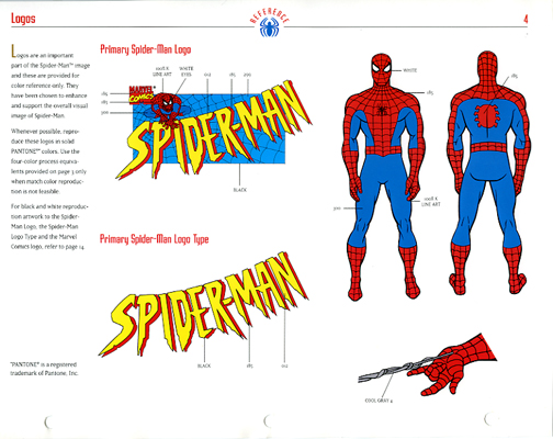
This page is the main Logo and Character detail page. It gives commentary on logo colors as well as the main colors of our hero, Spider-man, and is one of the "upfront" materials of the guide. This style guide is similar to most, giving you the main details of the heroes first, some poses in black and white, villain colors, situational art, repeat patterns, and some alternate logos. All in all some nice artwork, very clean and ready for scanning. When this guide was produced, you would have to scan and streamline your artwork, then color and place on a given product. It was sort of rare then to get artwork CDs accompanying style guides and even then it was some of the larger licenses that did this.
Second, but not by any means second to Spider-man, is a situational artwork page from Batman: Carnival Capers Style Guide. This guide was a continuation of the Batman: The Animated Series Style Guide, and was one of many attempts by Warner Bros. to come up with stories or situations to place there animated heros in, and use villains that were featured in movies to help continue the brand. I would say that Warner Bros. along with Disney were two of the best at doing this, the idea was to keep the characters fresh and up to date.

I actually used this piece of artwork, though in it's black and white form and streamlined and then colored, to produce an amusement show poster for Play By Play. Later, a year or so after the line was finished we were cleaning out the art department and we all had a chance to grab a poster or two to take home, they were going to be trashed. These posters probably set the company back about 80 to 120 bucks each, we would produce one or two of each license, for a total of about 20 to 40 posters at about 2 foot wide by 4 foot tall. We had these things printed out on something like a high gloss dura trans and mounted on foam core, they were nice, too nice to be trashed. The one that I kept was this one and I still have it today, the design is not that great (not the artwork itself, but the design I set up), but it was my first of many show signs and it was of my favorite hero. I'll drop a pick up of it later on in another post in it's new home.
2 comments:
So, that Carnival Bat piece you have as a poster?! Nice. You really need to start showing off more of that collection on LOG!
Hey, my son and I are starting a little Spiderman site..do you think you could get your mits on more Spidey style guide stuff?
Does my Spider Sense tell me that there is going to be new Spider-man fan site in town???
You know the answer to the second part.
Post a Comment