Pages

Showing posts with label Style Guides. Show all posts

Monday, August 25, 2008

Kyrpto!


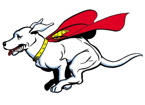
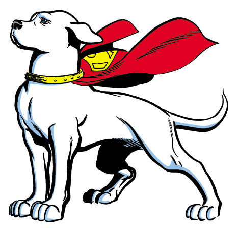
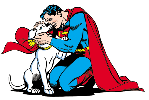
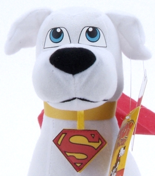
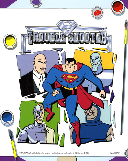
Well, I received a request to feature more from the style guides, in particular this one with mention of Krypto. Not wanting to let anyone down I thought the least I could do would be to throw some of the images from the disk up in a Krypto post while I scan some of the guide pages! Enjoy.


... and my favorite of the Krypto images.


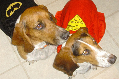
"The Girls" get in on the action... I give you Ace the Bathound and Krypto the Superdog!


... and a little bonus, a peek at something we are working on here at the factory!


Tuesday, June 24, 2008

The Animated Vulture


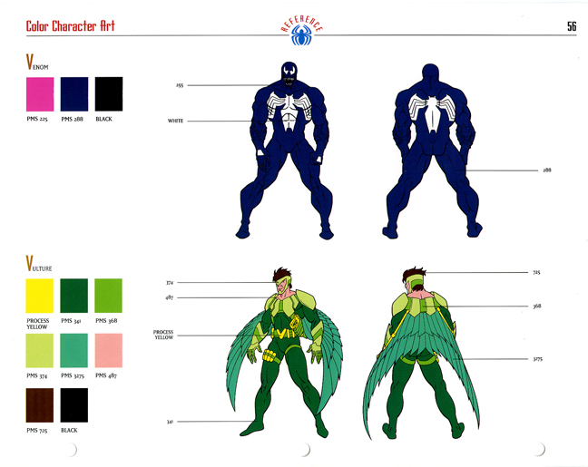
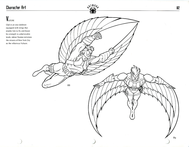
A few more pages from the Spider-Man Animated Series Style Guide. I have yet to watch an episode of the new Spectacular Spider-Man, but back in the 90's I tried to catch all the Spider-Man Animated Series. One of the villains that I thought had a cool character design was the revision of the Vulture. I thought the much younger looked worked for the cartoon, plus the addition of the higher tech costume.


These type of pages always appealed to me, not only because the gave all the color references, but some pretty cool action shots and situations so you could get a feel for the character.


I remember being pretty excited that the toy line was coming out, I had an image of the prototypes burned into my head thanks to Toy Fare, Tomart's, and Lee's magazines. I had planned on getting the series, but as usual budgets and lack luster actual production, plus the fact that I was trying to collect other lines at the time always squashed those plans.

Still, I find the Vulture figure from the line pretty cool (peeped here at Marveltoys.net, one of the best resources around for older Marvel toys) and since I missed it the first time around I could make a trip to the bay to see what bargains are to be found! Who needs a nice cushy retirement right? Hell I could do as the Vulture when I get old and fly around busting up superheroes!

Tuesday, March 4, 2008

2001: Classic Superman Style Guide


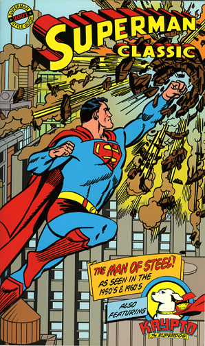
Here's a pretty cool find. It's a style guide for a Classic Superman program. Those that don't know, Style Guides are just that guides with graphics for use on products that support the licensed program. So in this case it's the classic imagery of Superman and his pal Krypto.

Today I'm just showing a scan of the cover with this short description. The guide measures 6 1/2 inches x 11 inches, 16 pages including the cover, contains logos, graphic treatments, and character artwork for "The Man of Steel! As seen in the 1950's & 1960's". The size and shape is very comic like, yet the cover is of a much sturdier and glossier stock. The interior pages are also a nicer stock about 80 lb. with a gloss finish. The inside back cover includes a clear pocket for the included CD of artwork.

I plan on featuring some more from this and other guides I have in my collection (note: all from the past, as newer guides for newer properties are kept confidential) as I think these are pretty neat finds and it's fun to see kind of the inside of product development.

Tuesday, September 4, 2007

Super Preview!


I was planning on posting this on Monday, but this week is going to be hectic at best. Shooting photos for an upcoming catalog, home repairs, back pains, and a mountain of other tasks. I'll be lucky to get any "real" work done. That said the posts might be a little sporadic this week.

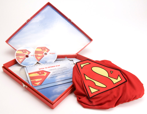
So what is this thing? This was a preview kit, or best guess a promo kit for the Superman Returns Movie. Well not so much as just the movie but a kit building hype for Superman across the board. These were sent out to license holders to fill them in to information about the upcoming movie, about the other Superman licenses in the Warner Bros. Stables, and the Man of Steel in general. This one came with a letter announcing the movie and other Superman properties, which I returned to the person it was addressed to, because it seemed a little personal even though it was probably a standard letter to all licensors.


Me being a fan of Style Guides and studio promo items and a fan of DC Comics Heroes, I had a chance to go through the material, after which I was offered it because it was taking up space in the offices. I sort of dug the case, plus it came with a cape! So how could I say no?

I will say that WB is one of the few studios that go out of there way to produce these crazy promo items, but in this case the enclosed discs fell a little short. Instead of the custom printed discs, they opted for the ink jet labels. Which I can't really blame them because the case and cape are the real jewels in this set. I do wonder if the case is recycled from a previous superman style guide. If anyone knows, drop me a comment.

Wednesday, July 11, 2007

Superman: The Animated Series Style Guide


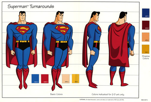
Well I was asked if I happen to have the Superman: The Animated Series Style Guide and thought this would be the best way to answer.

While not one of my most my favorite character in the DC Universe, I do like some interpetations of Sups, the Animated version here is one of them. I did not set out to collect the Superman Style Guides, I just sort of ended up with them. I also have a few select Superman items in the ole' collection, so I guess I have a soft spot for the big guy. I always thought Suoerman was what you wanted to be, but Batman is what you usually end up as (not sure where I heard that, but I've always liked it) As I said in the last post this property was one of the ones I was in charge of, kind of cut my art direction teeth on it so to speak.

And in anticpation of the next question, as soon as I can get to all my guides I'll drop you some art Matt...

Tuesday, May 8, 2007

More Styleguides!

Today for your viewing pleasure I have a couple of style guide pages.

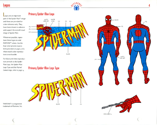
First up since Spider-man seems to be on everyones minds these days I have a page from the Spider-man Animated Series Style Guide. Spider-man's Animated series came along around the mid nineties on the heals of another great superhero animated series. I'll admit I was a fan of both, and the Spider-man series did seem rather well done for younger market. Characters where bright and colorful, even the villains, and the toys that were spawned for this cartoon matched the animated versions quit well. even today these are some of my favorite toys from any Spider-man show or movie.

This page is the main Logo and Character detail page. It gives commentary on logo colors as well as the main colors of our hero, Spider-man, and is one of the "upfront" materials of the guide. This style guide is similar to most, giving you the main details of the heroes first, some poses in black and white, villain colors, situational art, repeat patterns, and some alternate logos. All in all some nice artwork, very clean and ready for scanning. When this guide was produced, you would have to scan and streamline your artwork, then color and place on a given product. It was sort of rare then to get artwork CDs accompanying style guides and even then it was some of the larger licenses that did this.

Second, but not by any means second to Spider-man, is a situational artwork page from Batman: Carnival Capers Style Guide. This guide was a continuation of the Batman: The Animated Series Style Guide, and was one of many attempts by Warner Bros. to come up with stories or situations to place there animated heros in, and use villains that were featured in movies to help continue the brand. I would say that Warner Bros. along with Disney were two of the best at doing this, the idea was to keep the characters fresh and up to date.

I actually used this piece of artwork, though in it's black and white form and streamlined and then colored, to produce an amusement show poster for Play By Play. Later, a year or so after the line was finished we were cleaning out the art department and we all had a chance to grab a poster or two to take home, they were going to be trashed. These posters probably set the company back about 80 to 120 bucks each, we would produce one or two of each license, for a total of about 20 to 40 posters at about 2 foot wide by 4 foot tall. We had these things printed out on something like a high gloss dura trans and mounted on foam core, they were nice, too nice to be trashed. The one that I kept was this one and I still have it today, the design is not that great (not the artwork itself, but the design I set up), but it was my first of many show signs and it was of my favorite hero. I'll drop a pick up of it later on in another post in it's new home.

Tuesday, April 3, 2007

BTAS


One of my favorite cartoons of all time is Batman The Animated Series (BTAS for short). This cartoon had really great stylized artwork that has been compared, in style, to the old Max Fleiser Superman cartoon of the 30's. Bruce Timm was the madman behind this cartoon, as well as the newer Justice League Unlimited Series. If you're into Batman animation, then you probably know more than I would about Bruce and team and the great imagery that they have produced over the years.

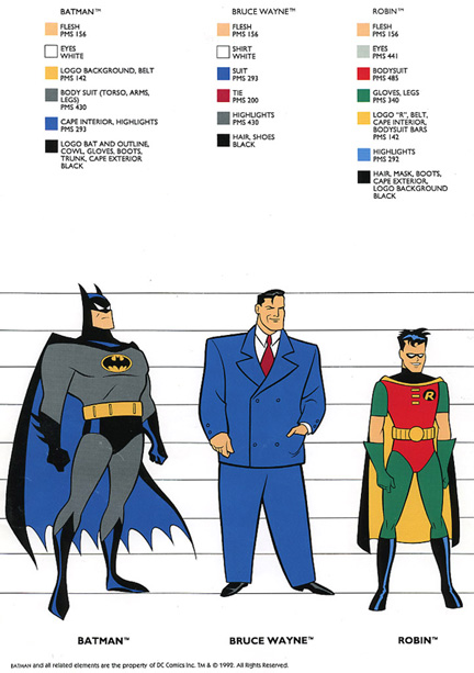
What I bring to you today is a page from the BTAS style guide. If you have read past posts you would know that I'm sucker for these style guides and that the guides themselves are used by Licensees to produce everything from toys to household goodies. This page would be used to check your color usage and scale of the characters in relationship to each other. I happen to have the whole guide for this cartoon and I consider it among one of my favorite guides. This actual guide was used as reference for plush and inflatable development back in the late 90's. I had worked on a few BTAS products for a small amusement toy company around that time, and when the license was up they were going to through out the old guides and offered them to me instead. I will be bringing you some of those items that I had developed for the amusement industry in future posts so stay tuned.

Monday, February 19, 2007

Batman Beyond Style Guides!


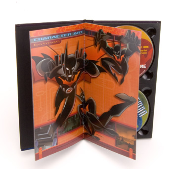
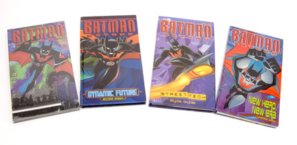
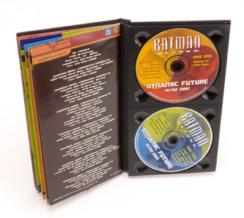
A friend, we'll call him William to protect his identity, has just handed me a set of Batman Beyond Style Guides. These are the guides that companies use to help design and manufacture things like Batman toys, in this case Batman Beyond!

These are, to date, my favorite style guides I have ever used. They are beautifully bound little books that have the CD trays for the artwork built right in. Each has a hard gloss cover, and gloss pages that have the artwork included on the CDs jumping out at you in four color process.

I remember using these to help sculpt the Batman Beyond Head mentioned in an earlier post, and also to set up graphics for various products. I never thought I would see these again and am glad William thought enough to bring these to me, knowing I'm a Batman Fanatic and having sat through many a lunch where I talked about these very same style guides. I hope to go through these in a little more detail in the future, but for now enjoy these pictures. Oh and William lunch is on be buddy!